DROUGHT MONITORING TOOLS
Drought is often discussed as an agricultural issue, but from the perspective of civil engineering it is far broader than that. It affects reservoir operation, river-basin planning, groundwater systems, irrigation infrastructure, municipal water supply, hydropower, and the long-term resilience of water-related infrastructure. In other words, drought is not merely a shortage of rainfall; it is a systems problem that propagates through the hydrologic cycle and eventually reaches the engineered systems on which societies depend.
Because of this, drought should be understood not only as a climatic phenomenon but also as a core water-resources engineering problem. A precipitation deficit can evolve into soil-moisture stress, reduced streamflow, declining reservoir storage, groundwater depletion, and operational challenges for water distribution and allocation. For civil engineers, these are practical design, planning, and management concerns.
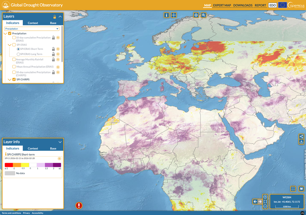
At the global scale, several important drought initiatives already help researchers, practitioners, and institutions monitor and interpret drought. The Copernicus Global Drought Observatory (GDO) provides global drought monitoring through maps, indicators, and data services, based on satellite observations, hydro-meteorological models, and other inputs. It is a strong scientific and institutional platform for operational monitoring and formal assessment.
The FAO Drought Portal represents another major contribution, with a stronger emphasis on resilience, preparedness, agriculture, and food security. Within that broader ecosystem, FAO’s Drought Impact Assessment Platform (d-iap) is designed as a global web-based tool to evaluate drought impacts on crop and water productivity, including irrigation water requirements, under present and future climate scenarios.
A third highly influential example is the U.S. Drought Monitor, which, although focused on the United States, has become one of the best-known drought communication products in the world. It is updated weekly and uses a widely recognized classification system from D0 (abnormally dry) to D4 (exceptional drought). Its importance lies not only in monitoring, but also in how effectively it communicates drought severity to decision-makers and the public.
These platforms are extremely valuable, but they are not identical in purpose. Copernicus GDO is strongly institutional and monitoring-oriented. FAO tools are particularly powerful for agriculture, food systems, and impact assessment. The U.S. Drought Monitor is especially influential in classification and public communication. Seen together, they show that global and regional drought monitoring is not a single-method field; it is a combination of scientific indicators, institutional mandates, user needs, and technical infrastructures.
It is against this broader landscape that GlobalDroughtMap.com becomes interesting. Its value is not that it replaces these established systems, but that it offers a different entry point—one that is especially relevant for visual learning, global comparison, and modern geospatial data delivery. In an educational context, that distinction matters.
As a faculty member in the Department of Civil Engineering at METU, I see drought as a topic that should be taught not only through equations, indices, and reports, but also through interactive and comparative spatial understanding. In our curriculum, students encounter these themes through courses such as CE378 Water Resources Engineering, which introduces hydrology and water-resources engineering concepts including precipitation, streamflow, infiltration, and basin processes. At the graduate level, CE530 Modeling In Statistical Hydrology explicitly includes applying water-balance analysis to complex problems and calculating common drought indices.
From a teaching perspective, one of the recurring difficulties is scale. Students may understand the theory of drought in a lecture setting, but they often find it harder to connect that theory with real patterns across continents, climate zones, and river basins. This is where a global visualization platform can become educationally powerful.
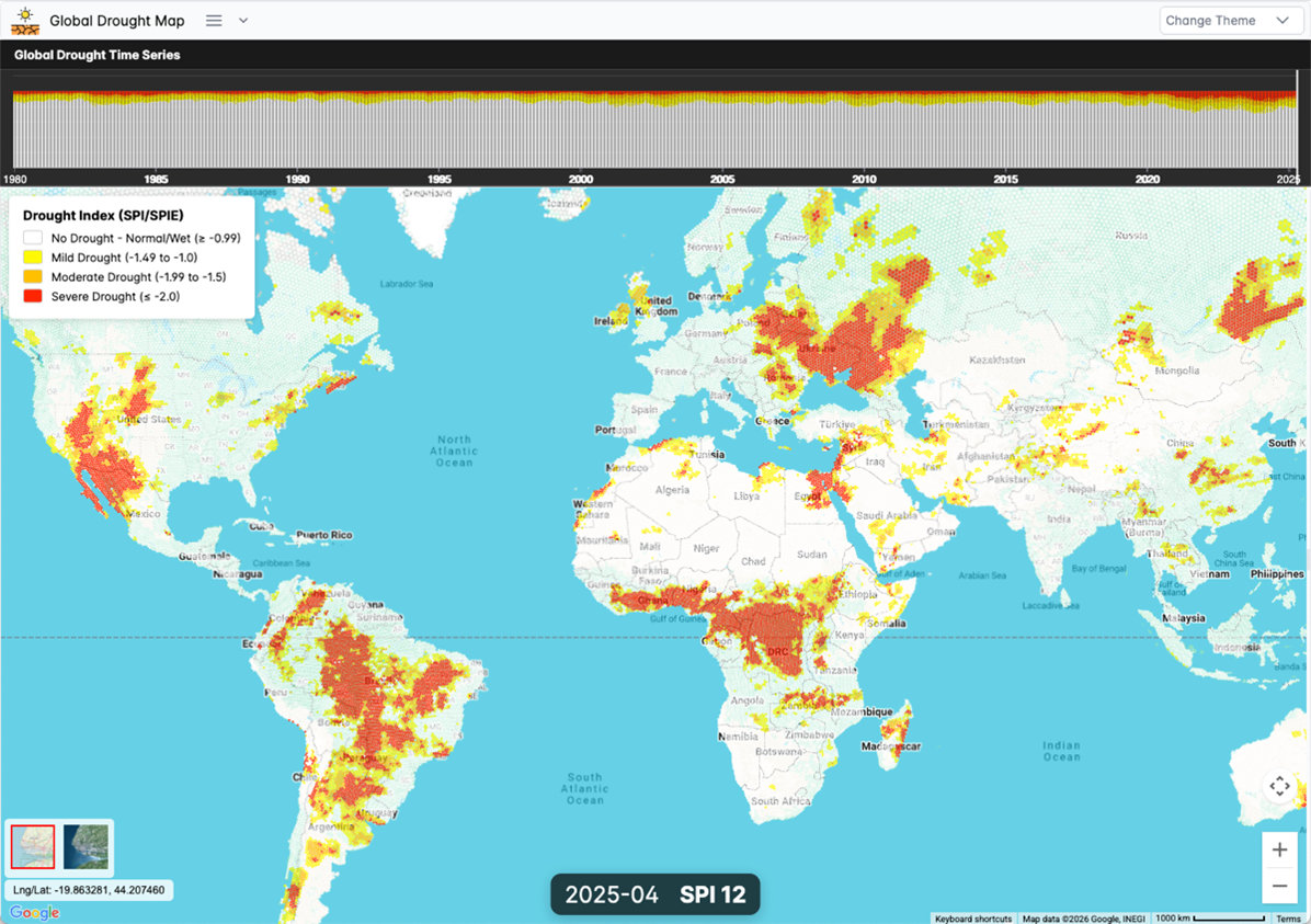
In that respect, GlobalDroughtMap.com stands out because of its visual approach. As described for the project, it uses Uber’s H3 hexagonal grid system, which is a discrete global grid that partitions the world into hexagonal cells and supports aggregation across multiple levels of precision. For a global drought map, that is an important design choice. Such hexagonal indexing can provide a more visually uniform and analytically consistent way to compare spatial patterns than many traditional polygon-based views, especially when the aim is to communicate broad regional gradients and global structure.
This is where the platform begins to differentiate itself from some of the more institutional drought portals. Many major systems are built first for monitoring workflows, reporting, or sector-specific assessment. GlobalDroughtMap.com, by contrast, appears especially well suited to exploration: allowing students and users to move quickly across the world, compare drought conditions between different geographies, and develop intuition about the global diversity of drought expression. That makes it highly useful in the classroom, where clarity and comparative visualization are often just as important as methodological sophistication.
Its technical background is also notable. According to the project design, the platform uses Parquet as a core data format. Apache Parquet is an open-source, column-oriented file format designed for efficient data storage and retrieval, with strong compression and query performance for analytical workloads. For a global drought platform, this is a state-of-the-art choice: large spatio-temporal datasets can be stored compactly, and only the needed slices of data can be accessed for a given request instead of loading entire files into memory.
The project also adopts a serverless-oriented architecture, which is another modern design decision. Serverless approaches are attractive because they can support automatic scaling, high availability, and reduced infrastructure management overhead compared with always-on server-heavy systems. For a public-facing environmental platform operating at global scope, this kind of architecture is highly relevant: it can simplify deployment, improve responsiveness, and reduce operational complexity.
Taken together, this combination of H3-based visualization, Parquet-backed analytics, and serverless delivery gives GlobalDroughtMap.com a distinctly contemporary technical profile. In that sense, the platform is not only about drought information; it is also an example of how modern geospatial systems can be designed using cloud-native and state-of-the-art data-engineering principles.
This matters educationally because today’s civil engineers increasingly work at the intersection of hydrology, geospatial technology, and digital infrastructure. Students need to understand not only drought indicators, but also how environmental intelligence is built, stored, served, and visualized. A platform such as GlobalDroughtMap.com can therefore support two levels of learning at once: first, learning about drought as a hydrologic and engineering phenomenon; second, learning how modern data architecture can make global-scale environmental insight practical and accessible.
It is also worth emphasizing that building something worldwide is inherently difficult. Even national drought systems are challenging. At the global level, the complexity increases substantially: different climate regimes, different source-data characteristics, different update cycles, different indicator conventions, and the need to make outputs understandable to very different audiences. A global platform is therefore solving not just a scientific problem, but also a technical, communicative, and design problem.
For students, this is exactly why comparison is valuable. By examining established platforms such as Copernicus GDO, FAO’s drought systems, and the U.S. Drought Monitor alongside a newer platforms such as GlobalDroughtMap.com, they can see that drought monitoring involves multiple philosophies. Some systems are built for institutional reporting, some for agricultural impact, some for public classification, and some for exploratory geospatial understanding. That comparison itself is educational.
From my perspective, this makes GlobalDroughtMap.com a useful complement to the existing drought-information landscape. Its strength lies particularly in visual accessibility, global comparability, and a modern technical architecture that reflects current best practice in geospatial analytics. For civil-engineering students, this helps create a bridge between hydrologic theory, water-resources decision-making, and the digital tools that increasingly shape professional practice.
At METU, where students are expected to build strong analytical foundations while engaging with real-world water challenges, I believe this broader perspective is essential. Drought is not a distant topic. It is a growing engineering concern that touches infrastructure resilience, basin management, and climate adaptation. Tools that make drought visible at the global scale—and that do so through strong visualization and modern technical design—can therefore play an important role in engineering education.
By Prof. Dr. Mustafa Tuğrul Yılmaz,
Department of Civil Engineering,
Middle East Technical University (METU)